Histograms and Cumulative Frequency
Histograms are similar to bar charts apart from the consideration of areas. In a bar chart, all of the bars are the same width and the only thing that matters is the height of the bar. In a histogram, the area is the important thing.
Example
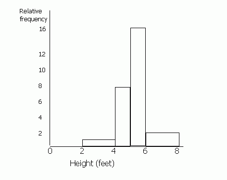
Draw a histogram for the following information.
| Height (feet) | Frequency | Relative Frequency |
| 0 - 2 | 0 | 0 |
| 2 - 4 | 1 | 1 |
| 4 - 5 | 4 | 8 |
| 5 - 6 | 8 | 16 |
| 6 - 8 | 2 | 2 |
(Ignore relative frequency for now). It is difficult to draw a bar chart for this information, because the class divisions for the height are not the same.
When drawing a histogram, the y-axis is labelled ‘frequency density’ or "relative frequency". You must work out the relative frequency before you can draw a histogram. To do this, first decide upon a standard width for the groups. Some of the heights are grouped into 2s (0-2, 2-4, 6-8) and some into 1s (4-5, 5-6). Most are 2s, so we shall call the standard width 2. To make the areas match, we must double the values for frequency which have a class division of 1 (since 1 is half of 2). Therefore the figures in the 4-5 and the 5-6 columns must be doubled. If any of the class divisions were 4 (for example if there was a 8-12 group), these figures would be halved. This is because the area of this "bar" will be twice the standard width of 2 unless we half the frequency.
Image
Cumulative Frequency
The cumulative frequency is the running total of the frequencies. On a graph, it can be represented by a cumulative frequency polygon, where straight lines join up the points, or a cumulative frequency curve.
Example
| Height (cm) | Frequency | Cumulative Frequency |
| 0 - 100 | 4 | 4 |
| 100 - 120 | 6 | 10 (= 4 + 6) |
| 120 - 140 | 3 | 13 (= 4 + 6 + 3) |
| 140 - 160 | 2 | 15 (= 4 + 6 + 3 + 2) |
| 160 - 180 | 6 | 21 |
| 180 - 220 | 4 | 25 |
These data are used to draw a cumulative frequency polygon by plotting the cumulative frequencies against the upper class boundaries.