Box Plots
Box plots show key points within a data range, such as the median and the distribution of the data.
Box plots are particularly useful when describing the differences in populations.
Describing Populations
To compare different populations you can use the averages and the ranges. The results of a survey on salaries of Nurses and Teachers have been plotted below:
Image
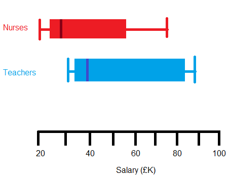
How could you describe each distribution and what are the key differences? Do Nurses or Teachers earn more?
Nurses: the median salary is £30k, the Inter Quartile Range (IQR) is 60 – 25 = £35k.
Teachers: the median salary is £40k, the IQR is 80-30 = £50k.
The box plot suggests that teachers earn more because their median salary is higher. Their Inter Quartile Range is also higher meaning there is a greater variation in salaries for teacher than there is for the nurses.
The Interquartile Range is a measure for the spread of the middle 50% of a population.